Uniapp中自定义组件选择年月
month-picker 月份选择器组件
组件介绍
month-picker 是一个用于选择年月的自定义组件,基于 uni-app 开发,提供了简洁的月份选择功能。
解决弹框底部出现底部页面区域
safe-area属性设为true时,即可解决这个问题
效果如图
功能特点
支持选择年份和月份
可设置默认选中的年月
自动限制当前年份的可选月份
提供清晰的视觉反馈和交互体验
使用方法
基本用法
<template>
<month-picker
v-model="selectedMonth"
@change="handleMonthChange"
/>
</template>
<script>
import MonthPicker from '@/pages/components/date-picker/month-picker.vue'
export default {
components: {
MonthPicker
},
data() {
return {
selectedMonth: '2023-05'
}
},
methods: {
handleMonthChange(value) {
console.log('选择的月份:', value)
}
}
}
</script>
属性说明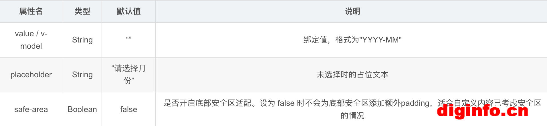
事件说明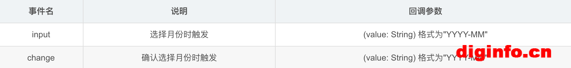
month-pick 核心代码
<template>
<view>
<view class="date-selector" @click="showPopup">
<text>{{ displayText }}</text>
<uni-icons type="bottom" size="14" />
</view>
<uni-popup ref="popup" type="bottom" class="custom-picker-popup" :safe-area="false" :background-lock="true">
<view class="custom-picker">
<view class="picker-header">
<text @click="closePopup">取消</text>
<text @click="confirmMonth">确定</text>
</view>
<picker-view :value="dateValue" indicator-class='pickerCol' @change="handlePickerChange">
<picker-view-column class="picker-item">
<view v-for="(year, i) in yearList" :key="i">{{ year }}年</view>
</picker-view-column>
<picker-view-column class="picker-item">
<view v-for="(month, i) in maxMonth" :key="i">{{ month }}月</view>
</picker-view-column>
</picker-view>
</view>
</uni-popup>
</view>
</template>
<script>
export default {
props: {
// 默认选中的年月(格式:YYYY-MM)
value: {
type: String,
default: "",
},
// 占位文本
placeholder: {
type: String,
default: "请选择月份",
},
},
data() {
return {
yearList: [],
selectedYear: new Date().getFullYear(),
selectedMonth: new Date().getMonth() + 1,
dateValue: [0,0],
maxMonth: 12,
};
},
computed: {
displayText() {
const currentTime = `${new Date().getFullYear()}年${
new Date().getMonth() + 1
}月`;
if (!this.selectedYear || !this.selectedMonth) return currentTime;
return `${this.selectedYear}年${this.selectedMonth}月`;
},
},
created() {
this.generateYearList();
this.setDefaultValue();
},
mounted() {
},
methods: {
generateYearList() {
const currentYear = new Date().getFullYear();
this.yearList = Array.from(
{ length: 10 },
(_, i) => currentYear - 9 + i
);
},
setDefaultValue() {
const [year, month] = this.value.split("-");
if (!year || !month) {
if(this.selectedYear){
this.dateValue[0] = this.yearList.indexOf(parseInt(this.selectedYear));
this.dateValue[1] = parseInt(this.selectedMonth) - 1;
this.updateMaxMonth(parseInt(this.selectedYear));
}
return;
};
this.dateValue[0] = this.yearList.indexOf(parseInt(year));
this.dateValue[1] = parseInt(month ) - 1;
this.updateMaxMonth(parseInt(year));
},
updateMaxMonth(year) {
if (year === new Date().getFullYear()) {
this.maxMonth = new Date().getMonth() + 1;
} else {
this.maxMonth = 12;
}
},
showPopup() {
this.$refs.popup.open();
},
closePopup() {
this.$refs.popup.close();
},
confirmMonth() {
this.selectedYear = this.yearList[this.dateValue[0]];
this.selectedMonth = this.dateValue[1] + 1;
this.$emit(
"input",
`${this.selectedYear}-${this.selectedMonth.toString().padStart(2, "0")}`
);
this.$emit(
"change",
`${this.selectedYear}-${this.selectedMonth.toString().padStart(2, "0")}`
);
this.closePopup();
},
handlePickerChange(e) {
const [yearIndex, monthIndex] = e.detail.value;
this.updateMaxMonth(this.yearList[yearIndex])
this.dateValue[0] = yearIndex;
this.dateValue[1] = Math.min(monthIndex,this.maxMonth - 1) ;
},
},
};
</script>
<style scoped lang="scss">
.picker-view {
display: flex;
align-items: center;
padding: 10px;
background-color: #f5f5f5;
border-radius: 4px;
}
.custom-picker {
background-color: #fff;
border-radius: 12px 12px 0px 0px;
}
.date-selector {
font-size: 32rpx;
color: #020b1c;
}
.picker-header {
display: flex;
justify-content: space-between;
padding: 12px 16px;
border-bottom: 1px solid #eee;
}
picker-view {
height: 560rpx;
}
::v-deep .pickerCol {
height: 90rpx;
line-height: 90rpx;
border-radius: 20rpx;
}
.picker-item {
font-size: 32rpx;
color: #333;
text-align: center;
view {
line-height: 90rpx;
}
}
::v-deep .uni-picker-view-highlight {
/* 修改选中项的高亮背景 */
background-color: #eee !important;
height: 80rpx;
}
</style>
注意事项
当选择的年份为当前年份时,月份选项会自动限制为当前月份及之前的月份
年份范围为当前年份前9年至当前年份
组件使用了 uni-popup 和 uni-icons,请确保项目中已引入这些组件
safe-area属性设为false时,弹出层不会为底部安全区添加额外padding,适合自定义内容已考虑安全区的情况;设为true时会自动适配底部安全区域,避免内容被遮挡。


全部评论